Unclear entry into the catalogue
The homepage did not provide a clear path to product categories or communicate the brand’s offer quickly enough.
The existing website had major usability and structural issues, so the experience was redesigned almost from scratch — from information architecture and key user flows to the final interface.
I reviewed furniture e-commerce websites to identify effective patterns for catalogue structure, navigation and product customization. Since approximately 50% of Mobo’s website traffic came from mobile devices, I paid particular attention to how product discovery and configuration flows were adapted for smaller screens. The findings helped define the structure and key interactions for the redesigned experience across desktop and mobile.


Based on the existing website audit, competitive benchmark and product knowledge, I mapped a hypothesis-based customer journey from product discovery to purchase. This helped identify potential friction points and define opportunities for the redesigned experience.
| Homepage | Catalogue browsing | Product page | Checkout | |
|---|---|---|---|---|
| User goals | Understand what products the brand offers. | Quickly browse the available collections. | Understand the product before purchase. Customize the product to fit their needs. | Complete the order quickly. |
| Potential friction | No quick path to the catalogue or a relevant category. The brand does not yet feel trustworthy. | Users can get lost among numerous collections. No fast way to filter products by key parameters. | Size and material changes are not visualized clearly enough. Not enough detail to compare and evaluate options confidently. | Long forms and extra steps make checkout frustrating. No clear place to leave additional order details. |
| Design opportunities | Build trust through clear visuals and brand presentation. Add quick access to the catalogue and key categories. | Highlight differences between collections. Make catalogue navigation easier to scan. | Add visual feedback for size and material changes. Add comparison and technical details. | Simplify the checkout form. Add a separate field for order notes. |
The homepage did not provide a clear path to product categories or communicate the brand’s offer quickly enough.
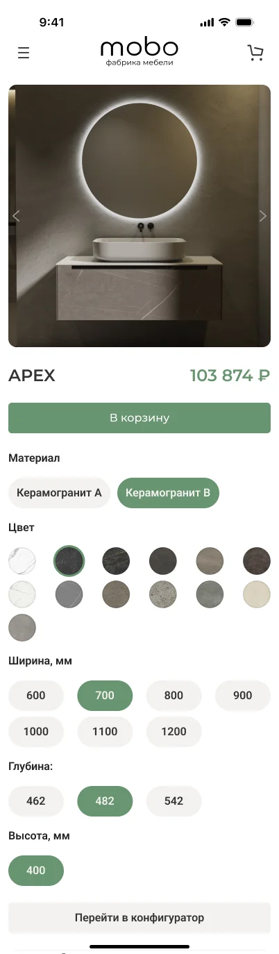
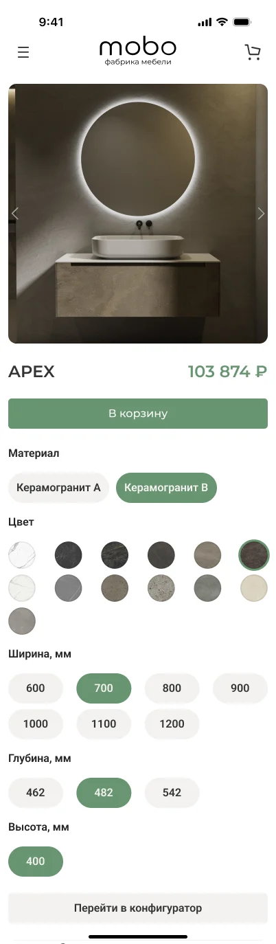
Changes in size, material and other parameters needed clearer visual feedback and supporting technical information.
Numerous collections and limited filtering made it harder to find and compare suitable products.
The order flow contained unnecessary fields and lacked a clear way to provide additional order details.
The journey findings were translated into the website structure and key user flows. I prioritised clearer catalogue access, easier product discovery, visible customization feedback and a shorter checkout process.
Since approximately 50% of the website traffic came from mobile devices, I started by defining the core mobile journey — from product discovery and catalogue navigation to customization and checkout.


The moodboard defines the overall visual language of the interface. It reflects a calm, minimal aesthetic — clean shapes, neutral tones and a focus on materials — helping keep attention on the product and creating a sense of clarity and refinement.
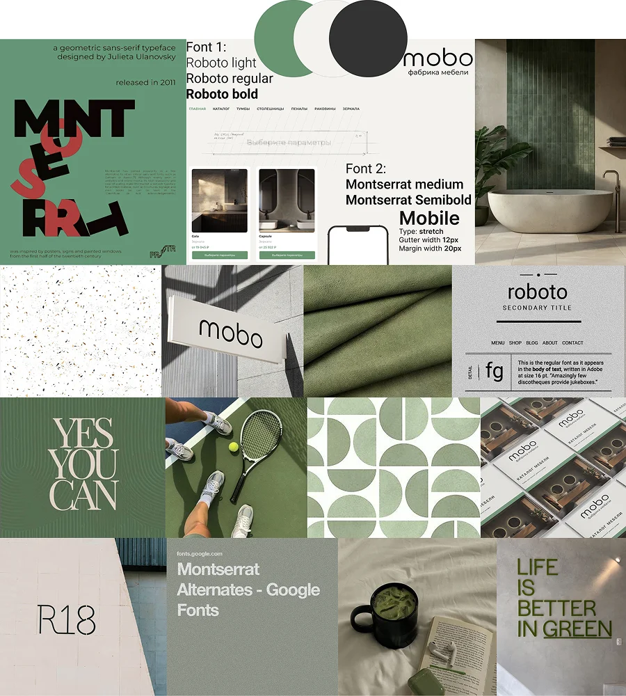
I also worked on the mobile version, focusing on preserving key user flows and making the experience comfortable on smaller screens.


One of the key goals was to make material and color selection as clear as possible. Changes are reflected instantly in the product, helping users better understand the result and make decisions faster.